Tips to create Animated charts – Data Visualization
—————————————————————————————
Hi! Please tell me what kind of Qlik content you think is relevant or interesting to have in the channel (use the link below). Thanks!
Link: https://approbato.com/blog/quick-qlik-survey/
—————————————————————————————
Who doesn’t like those animated charts?
Every manager loves to see how sales or market penetration grew over time.
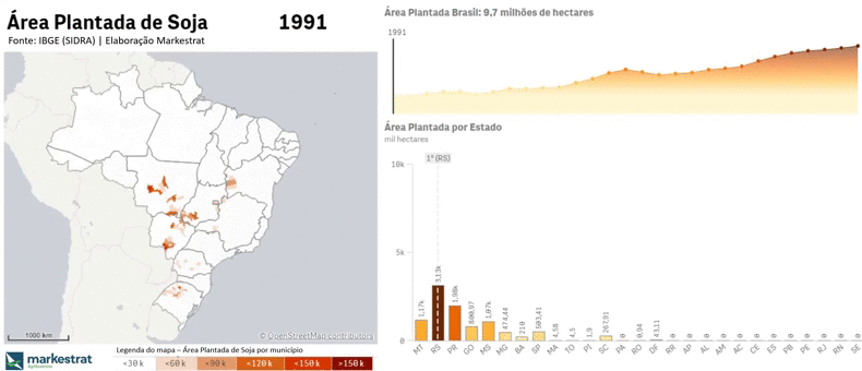
This animation shows the evolution of Soybean Planted Area in Brazil, and makes it easier to see the main areas and how fast it grew.

So here are some tips and steps to do this kind of visual:
I often use the gapminder tool to make some animated lines or bar charts, but now with Qlik’s new Animator extension things got much easier and interesting.

The animator automatically changes the date filter, and you can set it to aggregate over time or not.
If you have a bar/line chart, or any other chart that should display the years, use a set analysis to remove the filter impact. You can insert a reference line to enhance the visual.

But there is a problem: the animation is not smooth. Basically you are just changing filters, so you don’t have that moving effect as we have in GapMinder. In the example above (gif), there are more than 5000 cities in the map, so it needs to process a lot of data to display.
I set the time between steps to 4 seconds and recorded my screen. After that I had to speed up the video 8x to get a more dynamic effect.
In short, with Qlik Animator, Gapminder (there are some R scripts with this animation effect as well), a screen recorder and a video editor you can create gifs and awesome presentations.
For Power BI users: Power BI has a custom visual with the same purpose, called Play Axis.
If you read until here, look for some Hans Rosling’s videos – you might like it.
